Pages

Live blogging Feed

Wednesday, November 02, 2011

The 2011 Top 100 Global Brands And Their App Store Status

The 2011 Top 100 Global Brands And Their App Store Status:

It is our pleasure to release our latest Distimo Publication.


This report focuses on brands (as defined by the Interbrand 2011 Best Global Brands report) and how they perceive the fragmented app store space.


The major findings from this report are:


  • Brands have realized that publishing applications in the various app stores offers a viable channel to promote their brand, reach consumers, and for a subset of brands – sell content as 91% of the top brands have a presence in at least one of the major app stores.


  • This is a significant increase compared to 18 months ago when only 51% of the brands published or licensed an application.


  • Looking at specific app stores, we see that the Apple App Store for iPhone is by far the most popular app store for the top 100 global brands. The Google Android Market and the Apple App Store for iPad are both increasingly seen as good app stores for brands to promote their visibility and reach consumers.


You can now download this publication.


The press kit including all image files is also available.


Assessing the Smart TV Opportunity

Assessing the Smart TV Opportunity:

There has been increasing chatter about a new TV being developed by Apple.


My opinion on the subject was summarized in the post called Tele Vision. I contend that a TV cannot be smart until the content it delivers becomes smart. The logical conclusion is that the value chain needs re-integration so that the component which is not good enough (the content) can be improved along the dimensions that users value. And it cannot be improved unless the direction it needs to go into is aligned with the direction of the disruptive innovator. I won’t repeat the theory here, but it suffices to say that whatever will change television will do so by re-defining the core product not just the tools we use to consume it.


But today I wanted to address another question: how do we value the opportunity? In a back-of-the-envelope manner, can we tell if this business is big enough to try to fix.


The answer depends a lot on the business model of the disruptive entrant. The entry could depend on software or advertising or hardware or distribution, and each would have a different valuation.


But for the sake of calibration, I want to start with a proxy. The basic question of how many “terminals” exist to the value networks. How many units of TVs are sold and how many could a new entrant convert to a new paradigm?


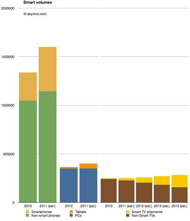
I prepared the following chart showing the world-wide TV market with a highlighted subset of so-called “smart TVs” (source TRi). The market is shown from 2010 actuals through 2014 estimates. To make it more interesting I also added similar data for two other markets. Mobile phones and PCs with their own sub-categories of smartphones and tablets as equivalent “high growth” opportunities.


When considering the opportunity, the Smart TV volumes are small relative to either tablets or smartphones. 2011 shipments are expected to be around 25 million Smart TVs, vs. 454 million smartphones and 51 million tablets. Looking forward, it seems that even by 2014, smart TVs will be smaller volumes relative to either (projected) smartphones or tablets.


A reason for this is that the TV market is not that big. It barely reaches 280 million units in 2014. Having reached saturation, the rate of growth is never assumed to be greater than 5%. The growth in the Smart TV business is assumed to be much higher however, being at least 100% in 2012, though off a low base.


But the concept of what “smart” means in this forecast is troubling. Christina Bonnington at Wired highlights many of the failings of Smart TV.


“In most cases consumers are buying a television with Internet connectivity as insurance. In other words, they are buying them just in case they need it in the future,” says Van Baker, a vice-president at the research firm Gartner. “Less than half of Internet connected televisions actually get connected to the Internet so clearly consumers don’t yet see this capability as a must have feature.”


There is vast under-consumption even if the devices are being purchased. This looks eerily familiar to the smartphone market before they became usable by the vast majority through the transformative touch input method.


So this market seems to be ripe for some serious re-definition. It may not be large today because there is nothing worth buying. Absent any innovation the forecasts can only foresee more of the same. If there is a breakthrough which “cracks” this puzzle then we might indeed witness unforeseen opportunity.


Estimating Samsung’s smartphone mix

Estimating Samsung’s smartphone mix:

Samsung no longer reports mobile phone shipments. The company’s phone market performance reporting is limited to the following:


Shipment : High-20%↑YoY (low-20%↑QoQ)


ASP : Slight increase QoQ


As the company did not report volumes or ASP last quarter either, the QoQ (Quarter on Quarter) growth estimates are almost useless. The only fragment that might be useful is the “High-20% YoY” given that they did publish units for Q3 2010: 71.4 million. This leaves the question of what “High-20%” means. Here are some ranges and what the result would be:


  • 92.1 million assuming 29% YoY growth

  • 91.4 million assuming 28%

  • 90.1 million assuming 27%


The “best guess” might be 91.4 million.


As the company also provides revenue for its mobile division (14.42 trillion Won) we can therefore estimate the average selling price: $142. Is this a slight increase? By a similar approach, last quarter’s ASP was $139, and assuming exchange rates did not vary widely, this increase is small enough to be called “slight”.


We also have a figure for the operating margin for the entire Telecom group (16.9%) which gives an operating profit of $2.2 billion.


The last piece of the puzzle is the number of smartphones Samsung shipped. Samsung said smartphones grew “more than 300%” year over year. That would imply 31.4 million. One estimate is from Strategy Analytics that suggests 27.8 but it’s coupled to an overall volume estimate of 88 million (well below the 91.4 million estimated above). The Wall Street Journal published an estimate of 28 million.


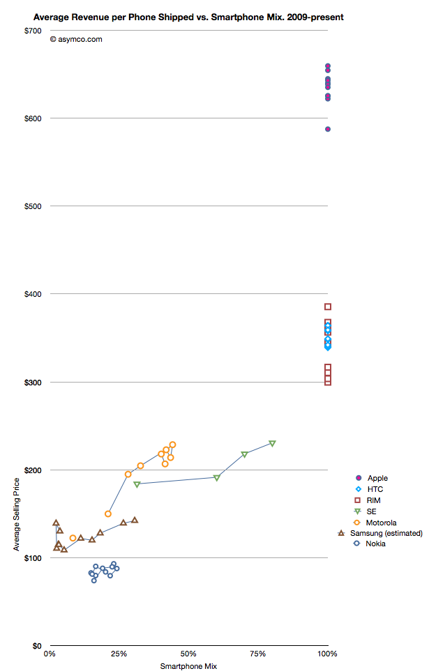
I have no idea how to narrow down this estimate, but if we go with the one that claims the highest precision (27.8 million) we get an estimate of about 30.4% of Samsung’s volumes being smartphones (what I call the “smartphone mix”). That is an interesting basis for comparing Samsung’s smartphone business to other companies’ smartphones. I prepared a graph showing how pricing is affected by the increasing mix of smartphones in vendor portfolios.


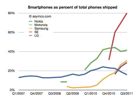
What the graph shows is the movement of prices as companies have increased their smartphone mix since Q1 2009. For example Sony Ericsson moved from 31% smartphones to 80% smartphones in about a year. Their ASP increased from $184 to $231. Some companies have not changed their mix. Apple, HTC and RIM have maintained 100% smartphones in their portfolios so their pricing has been consistently high ($650, $354 and $357 over last 12 months, respectively). Conversely, Nokia has struggled with its smartphone portfolio and as a result its pricing has remained stubbornly clustered below $100.


But the most interesting companies to watch are Samsung, Sony Ericsson and Motorola. You can see how their “vectors” or price migration point toward the sweet spot where HTC and RIM reside. Ideally, they would be very much better off with pricing in the $300 range.


Samsung is moving quite rapidly toward the sweet spot but the slope is not as steep as the others. That’s may be because SE and Motorola have much smaller volumes but it’s still an open question why, with an estimated 30% mix of smartphones, the pricing remains $60 lower than when Motorola was at the same mix or $40 lower than Se.


Some of the answer might be due to the number of “low end” smartphones (Bada?) that Samsung is selling or maybe their non-smartphone pricing is trending down a lot more rapidly.


Keep in mind that if we change the assumption of the number of smartphones to a lower number (i.e. below 27 million) then the trajectory of the Samsung line in the graph would increase and may match more closely the slope of the other two vendors.


I don’t have any reason to believe that it’s lower than 27 million but I don’t have any reason to believe that it’s above 27 million either. It’s an estimate.


If we believe it then we have to say that with a near tripling of smartphone mix (from 11% to 30.4%), the company grew its overall units by 28% and its revenue by 39% and pricing by 17%. Profits also grew by 130%.


It would follow then that switching to a 100% smartphone mix would make a lot of sense.


The Mobile Phone Landscape

The Mobile Phone Landscape:

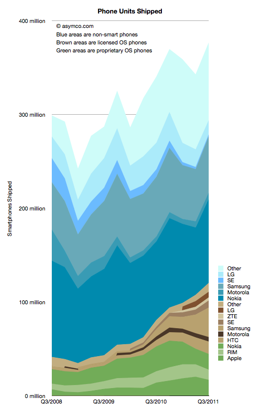
I collected all the data available so far and created a new graph that illustrates the complete market evolution over a three year period.


I chose a particular color scheme where shades of blue represent non-smart devices (think blue ocean), shades of brown are smartphones with licensed operating systems (Android for the time frame above) and shades of green as proprietary operating system smartphones. Multiple vendors are shown and those which sell both smart- and non-smart phones are shown twice. Note that the legend shows the vendors in the same order as the stacked areas.


There are several observations that are easy to make from this type of view:


  1. The smartphone market is growing rapidly, not surprisingly. However, the overall market is also growing. Smartphones as a percent of total units sold is at around 31%, up from 14% in Q3 2008. Smartphone units however have tripled in the same time frame (from 40 million to about 120 million). This means that almost all of the market’s growth has been smartphones with non-smart units barely increasing from 258 million to 272 million over a three year span.

  2. Non-smart phones are far more seasonal than smartphones. As smartphones increase in share, seasonality should match that of the other phone types.

  3. The number of branded smartphone vendors has increased significantly with “others” becoming a small part of the total. In contrast, the opposite effect is taking place in the non-smart market. Non-smart phone shipments have concentrated in two main brands and a large set of “others”. This bi-polar industry structure points to where the value is migrating and hence where rivalry is increasing. We can use these shifts as indicators of industry maturity.

  4. The opportunity for smartphone growth remains in the 70% un-penetrated blue area. However there is evidence that smartphone “switchers” are increasing with a noticeable decline in Nokia/Symbian and RIM. Apple’s decline in Q3 is likely to be reversed in Q4 but Apple’s share of all phones remains under 5%– a five-fold increase in share from 2008 but a sign of how much is left to be done.

  5. As Nokia shifts its Symbian portfolio to a licensed Windows Phone model the licensed cohort will tip over into an “all but two are licensees” line-up. This should be particularly worrisome as value is shifting to software and services and “super-platforms”. But before the disruption is complete, there are still some cards to play. Samsung and Nokia have vast non-smart volumes to convert and it’s unclear if they will do it with Android and Windows vs. layering their own proprietary Bada and future Nokia Linux platforms.


In the next few weeks I’ll publish details of all the measures of the market but this first “landscape” view gives a good initial perspective. In the mean-time the data is accessible from the Asymco “cloud” here.


Monday, October 24, 2011

Infographic: The Most Valuable Digital Consumers

Infographic: The Most Valuable Digital Consumers:

These days, Social/Local/Mobile seems to be driving much of the conversation about online opportunities. But at the end of the day, there is only one constant common denominator across the Web: the consumer. An understanding of this consumer and how they are influenced by social, mobile and local experiences online is vital to big brands looking to reach them on the Web. Nielsen and NM Incite, a Nielsen/McKinsey company, illustrate some findings that highlight digital consumer behaviors and consumption patterns that can help brand advertisers understand their most valuable customers and how they’re engaging across social, local and mobile.


social for wire


local for wire


mobile for wire


View full graphic with footnotes.

Social network popularity around the world in 2011

Social network popularity around the world in 2011:

social networks


Online social networks are everywhere these days, a truly global phenomenon. But where are the different social networks having the most success in terms of popularity? That is what we’ll try to answer in this post.


We have included 11 social networks in this survey: Facebook, Twitter, LinkedIn, Google+, Orkut, Tumblr, FourSquare, MySpace, LiveJournal, Hi5 and Bebo.


Please note that this isn’t meant to be an exhaustive list covering all social networks out there. There are literally hundreds of them.


To map popularity, we’ve used Google search statistics (their Insights for Search tool). This will give us a good indication of the interest – or popularity, if you will – of a social network in a given region. We’re basing this survey on search results from the past 90 days, so it’s a reasonably large, up-to-date sample. After all, we want to know the situation right now.


A few initial observations


We’ve gone through and summarized some of the information for you, but please feel free to scroll down and check out the individual social networks you’re interested in.


Top countries for each social network (in terms of interest)


  • Facebook is most popular in Turkey and Venezuela.

  • Twitter is most popular in Venezuela and Brazil.

  • LinkedIn is most popular in the Netherlands and India.

  • Google+ is most popular in Taiwan and Hong Kong.

  • Tumblr is most popular in the Philippines and Brazil.

  • FourSquare is most popular in Indonesia and Malaysia.

  • MySpace is most popular in Puerto Rico and Myanmar (Burma).

  • LiveJournal is most popular in Singapore and Russia.

  • Hi5 is most popular in Thailand and Romania.

  • Bebo is most popular in Ireland and New Zealand.

  • Orkut is most popular in Brazil and Paraguay. The interest shown for Orkut in Brazil far outstrips that of any other country.


It’s worth pointing out that this doesn’t necessarily mean that the majority of users come from these countries. We’re talking about sheer interest in a service. The size of the local user base will depend on the size of the Internet population in that country.


Also note that we haven’t compared the social networks against each other. This is a survey that examines where each social network has managed to garner the most interest in its service.


Some standout countries in this survey


  • Brazil is in the top five for Twitter, Orkut, Tumblr and Bebo.

  • Singapore is in the top five for LinkedIn, Tumblr, FourSquare and LiveJournal.

  • The United States is in the top five for LinkedIn, Tumblr and MySpace.

  • The Philippines is in the top five for Tumblr, FourSquare and LiveJournal.

  • India is in the top five for LinkedIn and Orkut.

  • The United Kingdom is in the top five for LinkedIn and Bebo.

  • Indonesia is in the top five for Twitter and FourSquare.

  • Venezuela and Turkey are in the top five for Facebook and Twitter.


That was just a brief summary. Why don’t you go ahead and have a look for yourself? We’ve listed the results for all the included social networks here below. We’ve also included direct links to Google Insights for Search if you want to dig even deeper into the results and play around a little.


Facebook


Interest in Facebook


Countries with the highest interest in Facebook:


  1. Turkey

  2. Venezuela

  3. Tunisia

  4. Colombia

  5. Dominican Republic


You can dig deeper into Google’s search stats for Facebook here.


Twitter


Interest in Twitter


Countries with the highest interest in Twitter:


  1. Venezuela

  2. Brazil

  3. Indonesia

  4. Turkey

  5. El Salvador


You can dig deeper into Google’s search stats for Twitter here.


LinkedIn


Interest in LinkedIn


Countries with the highest interest in LinkedIn:


  1. Netherlands

  2. India

  3. United Kingdom

  4. Singapore

  5. United States


You can dig deeper into Google’s search stats for LinkedIn here.


Google+


Interest in Google+


Countries with the highest interest in Google+:


  1. Taiwan

  2. Hong Kong

  3. Nepal

  4. Finland

  5. Honduras


(Ok, Hong Kong isn’t a country per se, but Google Insights for Search lists “regions”, which don’t always correspond to countries.)


You can dig deeper into Google’s search stats for Google+ here.


Orkut


Interest in Orkut


Countries with the highest interest in Orkut:


  1. Brazil

  2. Paraguay

  3. India

  4. Haiti

  5. Oman


You can dig deeper into Google’s search stats for Orkut here.


Tumblr


Interest in Tumblr


Countries with the highest interest in Tumblr:


  1. Philippines

  2. Brazil

  3. Australia

  4. United States

  5. Singapore


You can dig deeper into Google’s search stats for Tumblr here.


FourSquare


Interest in FourSquare


Countries with the highest interest in FourSquare:


  1. Indonesia

  2. Malaysia

  3. Singapore

  4. Thailand

  5. Philippines


You can dig deeper into Google’s search stats for FourSquare here.


MySpace


Interest in MySpace


Countries with the highest interest in MySpace:


  1. Puerto Rico

  2. Myanmar (Burma)

  3. United States

  4. Jamaica

  5. Trinidad and Tobago


You can dig deeper into Google’s search stats for MySpace here.


LiveJournal


Interest in LiveJournal


Countries with the highest interest in LiveJournal:


  1. Singapore

  2. Russia

  3. Belarus

  4. Ukraine

  5. Philippines


You can dig deeper into Google’s search stats for LiveJournal here.


Hi5


Interest in Hi5


Countries with the highest interest in Hi5:


  1. Thailand

  2. Romania

  3. Peru

  4. Laos

  5. Portugal


You can dig deeper into Google’s search stats for Hi5 here.


Bebo


Interest in Bebo


Countries with the highest interest in Bebo:


  1. Ireland

  2. New Zealand

  3. United Kingdom

  4. Brazil

  5. Australia


You can dig deeper into Google’s search stats for Bebo here.


Final notes


As you noticed, we only included a limited list of social networks in this survey. For example, we didn’t include social networks that are regional by nature, i.e. don’t have a global focus. There are plenty of country- or language-specific social networks that are successful in individual countries, for example VKontakte in Russia and the Russian-speaking countries of the former Soviet Union, Mixi in Japan, RenRen and Qzone in China, Hyves in the Netherlands, etc.


If you’re curious, you can check out a similar survey we did three years ago, in August of 2008. We thought an update was long overdue, since things change so rapidly in social media.


This was a post from the guys at Pingdom, a site monitoring service that makes sure you're the first to know when your site is down. Check it out for free.


Friday, October 21, 2011

Are Apple’s investments in PP&E extraordinary?

Are Apple’s investments in PP&E extraordinary?:

In his recent posts Horace took a look at Apple’s fixed assets and their development over the recent years. He also tested the hypotheses that Apple is making investments into machinery & equipment on which iOS devices are produced by overlaying iOS volumes with preceding changes in property, plant and equipment (PP&E).


The question that has arisen is: Are Apple’s investments in PP&E extraordinary?


To answer, I have compiled the capital expenditures (CapEx) for our previously established peer group [1].


But first we need to clarify what CapEx include and not include. CapEx includes investment into property, plants, equipment, office furniture, larger IT hardware and in some cases patents; CapEx do not include investment into long-term marketable securities or other long-term financial instruments, acquisitions or capitalized R&D. Furthermore, CapEx are gross values and are not net of any sold equipment [2]. CapEx are largely depending on a company’s business model and strategy. For example if you are a manufacturer you need equipment to operate, if you are a software company or a retailer, your business will not be capital intensive.


As the second calendar quarter of 2011 is the latest quarter for which all companies have reported figures, we will take a look at last twelve months’ (LTM) figures from Q2/2011 backwards. The following stacked bar chart shows the combined CapEx of our peer group:


The combined capital expenditures of our peer group for the LTM CQ2/2011 have outpaced even pre-crisis levels of investments and, combined, account for $34.7 billion. Samsung, a diversified manufacturer of IT hardware and other equipment, has invested more than $11.6bn with Google ($5.1bn), HP ($4.4bn) and Apple with $3.4bn following in line. While Google’s CapEx mostly account for its infrastructure of server farms and other IT hardware, HP’s CapEx mostly account for IT hardware it leases to its customers [3]. In absolute terms, Apple takes fourth place in CapEx spending for the last twelve months ending in CQ2.


Since the business model and sales magnitude varies largely in our peer group, we can also take a look at a common measure to compare CapEx intensity by dividing CapEx by sales achieved in the same period. For the last twelve months we can depict the following chart:


The average of the peer group accounts for 4.4% of CapEx over sales. Samsung’s and Google’s business model are clearly more capital intensive, while Apple’s CapEx ratio of 3.4% is below the peer group average but above some of its peers like Nokia, Dell, LG, HTC or Motorola Mobility. Interestingly, capital intensity of HP, Apple, Sony, Microsoft and Amazon is at a comparable level of around 3.4%.


As noted before, business models and strategies are significantly different among companies in our peer group. However, while Apple’s CapEx intensity is not extraordinary, Apple’s CapEx in absolute terms are among the largest in it this peer group and have grown constantly throughout a five year period.


Is this a good thing and why does it matter?


CapEx by itself does not tell us much. We still do not know in what companies specifically invest as financial regulations do not require detailed CapEx accounts. We know that even if a company is not growing assets they need to be maintained, upgraded and replaced – this spending is also called “Maintenance CapEx”. Everything else can be called “Expansion CapEx” associated with new product launches, entry to new business area or geographies or expansion of (manufacturing) capacity.


Therefore, Expansion CapEx is closely linked to expected organic sales growth in the future. So let’s go ahead and link CapEx ratio of the previous years with the sales growth of the following year. The following chart shows the cumulative average growth rate (CAGR) over the last four years versus the average of CapEx/sales ratio of the four last preceding years:


We can see that high CapEx efficiency has been achieved by Amazon, Apple and HTC with sales growth rates of 33-47%. RIM reached similar revenue growth but with higher CapEx intensity. Google and Samsung with high CapEx intensity have only reached modest growth rates. Dell, HP, Microsoft and Sony have not grown significantly but have close to average CapEx intensity.


We cannot state that CapEx in absolute terms have been extraordinary for Apple, but we can witness that with below average CapEx/sales ratio Apple outgrew in absolute terms Dell, LG, Microsoft, Nokia and Sony and has grown close to the revenue size of Samsung and HP in the last four years.


Notes:


  1. Excluding Lenovo (not reported) and Acer (extra-ordinary low numbers reported, to be investigated), Motorola Mobility figures only available for the last six quarters

  2. Minor differences may occur due to local Generally Accepted Accounting Principles (GAAP)

  3. HP assumes ownership of these assets and rents them to the customers who in turn have a smaller balance sheet and can run IT hardware CapEx through the income statement as lease expenses

Monday, October 17, 2011

Windows 7 just became the most widely used desktop OS in the world

Windows 7 just became the most widely used desktop OS in the world:

WindowsIn October, Windows 7 usage has for the first time surpassed Windows XP usage globally according to statistics from StatCounter. In other words, Windows 7 just became the most widely used desktop OS in the world.


This has been a long time coming. Windows XP has been at the top for eons (it launched 10 years ago, and once established, didn’t let go). Windows Vista never managed to threaten XP, so it wasn’t until Windows 7 came around that a shift really started to happen.


And that shift has happened fast. Windows 7 launched in October of 2009, then…


  • Within three months, it overtook Mac OS X.

  • Within 10 months, it overtook Windows Vista.

  • Now, two years after its launch, it’s finally overtaken Windows XP.


This is probably some kind of record.


Desktop OS market share over time


The chart above covers the entire life span of Windows 7 so far, counted from its official release date. According to Microsoft, they have already sold over 450 million Windows 7 licenses.


Windows XP is still a strong presence, but at least things are very much pointing in the right direction for Microsoft. They must be relieved. Microsoft surely didn’t expect XP to remain so dominant for so long. As for Windows Vista, it looks like it will die out before XP does in spite of being the newer OS.


You’ll see a close correlation between the combined decline of Vista and XP and the rise of Windows 7, which is to be expected. We’ve shown before that Windows 7 users upgrade from Windows XP and Vista, not from other operating systems. Windows eats Windows, OS cannibalism, so to speak. It’s mostly a natural consequence of Windows having such a dominant market presence.


Since the trend chart above isn’t ideal for showing the current situation in detail, here is a snapshot of the desktop operating system market share division as of October 2011, based on the first 10 days of the month:


Desktop OS market share, October 2011


It should be noted that these numbers are based on web usage (visitor stats to 3+ million sites), so it they won’t map exactly to the physical installed base. But these days, how common is it for PCs not to use the Web and the Internet? It’s also worth pointing out that it’s really the only “in use” metric to be had.


A funny little side note to end with: Over a year ago, we actually predicted that Windows 7 would overtake XP in November 2011. Ok, we were off by a month. So sue us… ;)


This was a post from the guys at Pingdom, a site monitoring service that makes sure you're the first to know when your site is down. Check it out for free.


The smartphone patent wars

The smartphone patent wars: Patent wars are raging in the smartphone industry as companies enter litigation in courts across the globe in pursuit of sales bans and royalties.


Monday, October 10, 2011

Facebook now as big as the entire Internet was in 2004

Facebook now as big as the entire Internet was in 2004:

FacebookAt the recent F8 conference Facebook revealed that they now have 800 million active users. Europe, with Russia included, has a population of 727 million. We now have a social network that is so large that it could fill up a major world region with people and still have some to spare (this “spare” being twice the size of Canada’s entire population).


Another cool comparison is that Facebook now has as many users as the entire Internet did back in 2004, the year Facebook was founded.


For fun, here are some other size comparisons you can make.


Facebook user base vs. internet population of world regions


The size of Facebook’s active user base is…


  • 38% of the entire current Internet population

  • 87% of the Internet population of Asia

  • 168% of the Internet population of Europe

  • 294% of the Internet population of North America

  • 370% of the Internet population of Latin America

  • 674% of the Internet population of Africa

  • 1,167% of the Internet population of the Middle East

  • 3,757% of the Internet population of Oceania / Australia


And comparing it with the entire population of a few selected countries, we get this:


Facebook user base vs. country populations


As a companion to the visual above, here you have the actual size relationships:


Facebook’s active user base is…


  • 2.5x the population of the United States

  • 3.9x the population of Brazil

  • 5.8x the population of Russia

  • 6.3x the population of Japan

  • 9.7x the population of Germany

  • 12.4x the population of France

  • 13x the population of the United Kingdom

  • 13.8x the population of Italy

  • 19.7x the population of Spain

  • 23.5x the population of Canada

  • 36.6x the population of Australia

  • 76.7x the population of Belgium

  • 88x the population of Sweden

  • 144.6x the population of Denmark

  • 185.7x the population of Ireland

  • Only India and China have populations larger than Facebook.


Note that the second chart compares entire populations, not just Internet populations (Internet users).


These numbers are pretty mind-boggling. Where will it all end? There’s still plenty of room left for Facebook to grow, but how massive can it get before it grinds to a halt?


Data sources: Population data from GeoHive. Internet user numbers from Internet World Stats.


But wait, there’s more! If you liked this post, check out this chart showing Facebook’s growth through the years, put into perspective by country populations, Internet stats, etc.: Facebook’s ginormous size put into context


This was a post from the guys at Pingdom, a site monitoring service that makes sure you're the first to know when your site is down. Check it out for free.


Friday, October 07, 2011

Can the Blackberry recover?

Can the Blackberry recover?:

The August comScore mobile survey (MobiLens) is out. It measures the penetration or consumption of various mobile products and services in the US over a three month period.


I track the change in this data over time. Here are some highlights:


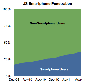
In August about 520,000 users switched to using smartphones (from non-smart phones) as their primary phone. This is a bit down sequentially from July but about average for the period starting January 2010.


Penetration increased by about 1 % to 36%.


Extrapolating this growth implies 50% penetration by September 2012. However growth is accelerating slightly so that tipping point may come sooner. Separately, T-Mobile reported that 75% of its device sales during this year have been smartphones, so if this is indicative of overall US market, then by next year it may in fact be quite difficult to find any non-smart phones to buy.


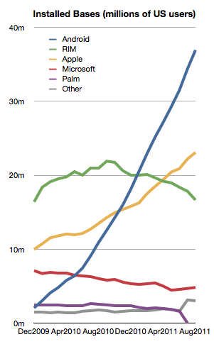
Among the smartphones, the different OSs have the following installed bases:


The growth in both Android and iOS has been fairly constant for the last 18 months.


Microsoft seems to be stabilizing at around 6%


But RIM shows an alarming deterioration. The company has lost 4.3 million users in the last year and is now at about the same number of users it had in late 2009. This is in a market that has more than doubled.


With only about 16.5 million US users and an average loss of half a million users per month, unless something drastic happens, RIM could lose its entire US user base by the end of next year.


During the last month alone RIM lost 1.2 million users. Management insists that new devices will boost sales but here we’re measuring the erosion in core users, not upgrades. It’s much more likely that those 4.3 million who left Blackberry went to other smartphones. To move from a Blackberry to a feature phone seems very improbable to me.


That means that Blackberry’s pain is probably iPhone or Android’s gain. This sort of switch is often painful and I can only imagine that it’s done with some reluctance. All the more remarkable then that RIM could not offer incentives to stay. The Blackberry brand is fading rapidly and brand value is very hard to re-build.


There’s one more thing.


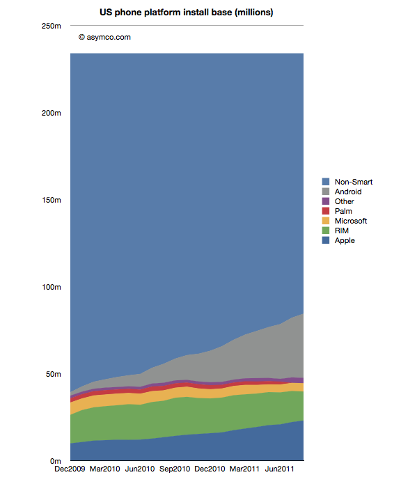
We can see platform rivalry in the installed base chart but the bigger battle is the competition with non-consumption. The following chart shows how overall platforms are faring as they carve up the feature phone market.


There are still 150 million Americans whose primary phone is not a smartphone. The conversion of those users is happening at a consistent pace but there are many years of growth remaining. I’ve often wondered if and when this pace would moderate. I suggested perhaps at 50% there would be an inflection point as the “easy money” would already have been made.


Much of that will depend on how the product (device + service) will be priced. It’s hard to get data on overall pricing. We can get some subsidized phone prices (for example now ranging from $0 to $400 for iPhone and probably similar for Android). What we don’t have is an average device+service price point for the industry. That’s what I would like to keep an eye on.


Operating System Market Share: September, 2011 Update

Operating System Market Share: September, 2011 Update:

Web Browser Market Share: September, 2011 Update

Web Browser Market Share: September, 2011 Update:

Mobile Device Manufacturer Market: September, 2011 Update

Mobile Device Manufacturer Market: September, 2011 Update:

Tuesday, September 20, 2011

Growth and punishment: The vector space model

Growth and punishment: The vector space model:

After processing more than 1500 data points on the performance of thirteen technology companies, patterns are beginning to emerge. The steps so far:


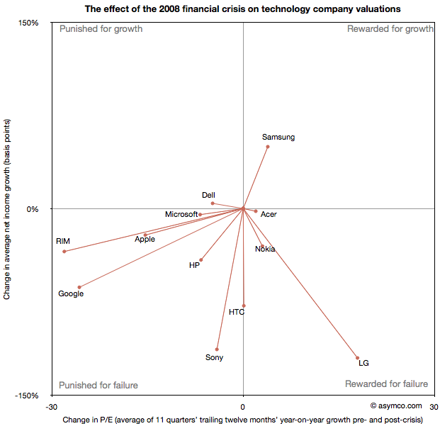
The final step is to plot the changes in the relationship between pre- and post-crisis for the set of companies normalized to the same starting point and then classifying them:


The chart shows how the “average P/Es” changed after 9/30/2008 vs. how the companies performed during those periods. An evocative categorization is suggested for the four quadrants.


One way to read the data would be as a degree of effect of the crisis. For example, in the case of HP, its P/E dropped by about 6.5 while its average growth decreased by 41 basis points giving an average of 0.16 drop in P/E for every basis point reduction in growth. That would be a fairly modest impact. In the case of HTC, the impact would be even less. The effect on P/E was zero even though growth dropped by about 78 basis points. At the same time the impact on Microsoft was severe with the P/E dropping as much as for HP even though its growth only moderated by 5 basis points.


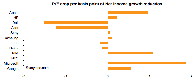
Therefore the “slope” (or angle in vector parlance) of each of the lines in the chart above may be interpreted as the severity of discount in value that the crisis invoked. Those values are shown the following chart:


A strong bar on the right half of the chart implies severe impact, a bar around the middle implies minimal impact and a bar in the left represents an inverse relationship where the market priced in opposition to performance[1]. What should be considered along with this chart is the quality of earnings and consistency of performance (which are shown in the posts linked above.)


Discussion


As noted in a previous article, there are really only six companies which had strong separation between pre- and post-crisis valuations: Apple, HP, RIM, HTC, Microsoft and Google. They are also the companies which had strong P/E drops (except for HTC). As a group they are also the companies with the best growth stories historically. This is perhaps the reason for the drop. Basically, because these were strong companies they “had the most to lose”. The market “punished” them more severely than the weaker companies because the weak had already been discounted.


The other observation is that Apple and RIM are not treated particularly differently. The drops in P/E are at about 1 for every basis point drop in growth. This means that the the degree of value lost is about the same as a function of growth loss. Microsoft seems to have been the most affected. We can argue that it is perhaps weaker than the others strategically so this is reflected here, but I doubt it’s weaker than RIM. Microsoft is also in contrast with Google which seems to have been given a lot of benefit of the doubt.


Nonetheless, this framework offers some hints on how technology companies have been treated after the crisis. There is no rightness or wrongness about this treatment but it may indicate potential for significant reaction in the opposite direction if and when macroeconomic conditions improve. These vectors are, in a way, proxies for volatility or “beta” in terms of correlation to the overall market. The greater the beta, the more amplification to market movement; the greater the slope value


As always, Apple is the canary in the coal mine as far as sentiment is concerned. What should be watched is the pricing reaction as Apple moves from a net reduction in growth to a net increase in growth. How will P/E react? The argument on this site so far has been that growth is exceptionally strong for Apple and it’s not being reflected in the price. However, in this analysis we’ve stretched the time frame and did a longer retrospective. On this new time scale growth is not yet at the levels Apple enjoyed in the heady days of 2005/6. Perhaps this growth will return and when it does we’ll get to see which way Apple’s vector moves.


—-


Notes:


  1. An inverse relationship with value can happen for various logical reasons, for example that a company has volatile performance which is depending on anomalous events.

Biggest mobile loser? The non-smart phone

Biggest mobile loser? The non-smart phone:

Yesterday comScore published survey results for EU5 (France, Germany, Italy, Spain, UK) on smartphone use and installed base. The headline is very similar to what would be written about the US: Android had phenomenal growth over the last twelve months. I also noted that the apparent growth of Google (16.2% share change) seemed to be matched by an apparent decline of Symbian (-16.1% share change.) However the reading of the data is not so simple.


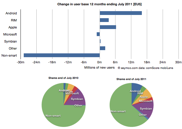
In order to understand what has happened to usage, it’s much more valuable to look at consumption and the actual number of users rather than change in share of a subset of the market. Consider the following charts:


The bar chart shows that three platforms gained users in the last year (ending July) and that there were negligible losses in users by others. Negligible except for non-smart phones. A remarkable 29 million users moved from non-smart phones to smartphones. Those switchers switched into Android (16 million), iPhones (6.3 million) and RIM (3.4 million). Symbian even gained about 330k users. Microsoft lost about 1 million but its platform has not been actively promoted in that time.


When seen as a pie chart, you can see how the usage shifted from non-smart to smart even more clearly. It does not appear that Android took share from Symbian at all. Android took share from non-smartphones. The table in the link from comScore leads one to conclude otherwise.


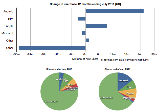
I took the same approach to look at the US data (also from comScore). It shows a similar pattern.


In the US, RIM was a net usage loser but its losses also paled to the losses of non-smart devices. In comparing with EU5 the pattern is very similar.


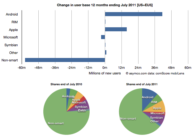
I then combined the EU5 and US data and provided a view into the combined markets (note scale change from previous two charts.)


This shows the change in platform phones more or less being from non-smart to Android and iPhones. The total population is 470 million people–not insignificant. The total number of non-smart devices abandoned is nearly 60 million in one year, which equals the total number of new smartphone users. That’s 12% of most of the developed world switching in one year. If this keeps up, the “tipping point” when smartphones will outnumber non-smart phones in use in these large markets will be in another year.


In terms of sales rate, the tipping point has already happened. Sales of smartphones crossed over in the US and Europe several quarters ago (November 2010 in EU5) and the trend is accelerating. Furthermore, if patterns of mobile technology adoption repeat as they have for the last two decades, emerging markets will follow in two to three years.


This tipping point observation has been repeated on this site a number of times when reflecting on the data in the US. Now it’s becoming clear that the same pattern has been underway in Europe as well.


The big picture from the survey data is just how vast the demand for smartphones is. Some platforms are benefiting more than others in terms of share of growth, but the biggest mobile loser is clearly the non-smart phone. Not only is it an unprofitable product for almost every vendor, it is also being increasingly shunned by buyers.


At the same time, at 450 million users we’re still only looking at less than 10% of the market. As this pattern spreads globally the platform install bases will be measured in the billions of users.

Mobile Impossible

Mobile Impossible:

In yesterday’s post about the “biggest mobile loser” I covered the exodus of users from non-smart devices in the US and EU5. I also said that what happens in those regions tends to happen in other regions with a time shift. In some regions it happens quicker but in most it happens more slowly.


But can we be sure that there isn’t vast non-smartphone growth in other regions? Well, no, we can’t be sure. At least not without access to reliable data.


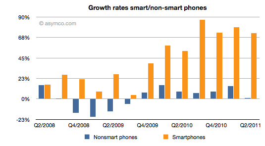
But what we can track is the overall non-smart phone market and compare it to the smartphone market. Here are the growth rates of the two sub-markets:


The difference is plain to see. We can also note that the non-smart market may be heading into a contraction–something noted by some analysts close to the market–but no real sign of that happening in smartphones.


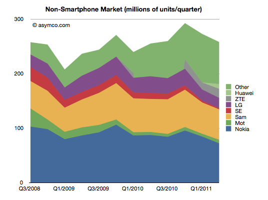
Beside growth, we can also see actuals and the split of various vendors’ volumes in the market.


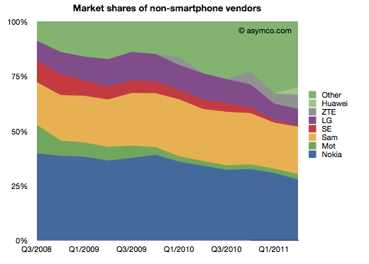
It’s also clear that the top line has not moved much in the last few years. Next, the shares of the vendors.


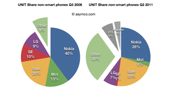
Finally, the before-and-after share pies.


We can see that the growth story, if there is one, is coming from low-end entrants. In late 2008 the main brands had 90% share. They now have about 60% (in a flat market.) The growth is all from “Other”.


What seems to be happening is that buyers in mature markets are swapping (or upgrading) from non-smart to smart and adopting new smartphone brands. At the same time, new users in emerging markets are increasingly adopting new non-smartphone brands.


So the question for the incumbent vendors is extremely important: Facing them are low-end and smartphone entrants engaged in a pincer movement, with obvious success; can the old brands survive?


The answer, as always, depends on whether the competition is symmetric or not. Low end competitors are usually structured around low cost structures. High-end competitors are exploiting new markets and new business models. For an incumbent to survive and fight on both fronts they’d have to adopt both of these models for themselves, simultaneously and quickly.


We can see that Sony-Ericsson and Motorola (Google) have thrown in the towel on the low end. The question of dual-front strategy is mainly relevant only for Nokia, Samsung and LG. LG is on the ropes and may actually be ready to exit the market so that really means Nokia and Samsung. Nokia has signaled continuing interest in the non-smart market (citing “the next billion users”). Samsung also seems to be hanging in there. Can they do it?


I cannot stress how difficult this is or how rarely it has been achieved. The two approaches are if not opposites then at least orthogonal. It’s like Mission Impossible. You can’t be a low cost global vendor while investing in R&D for differentiated platform-based devices. These are shaping up to be businesses requiring completely different skill sets. Few have the ability to host these skills inside one company. I can think only of one example.