Pages

Live blogging Feed

Monday, August 22, 2011

Updated AMP Index for Q2

Updated AMP Index for Q2:

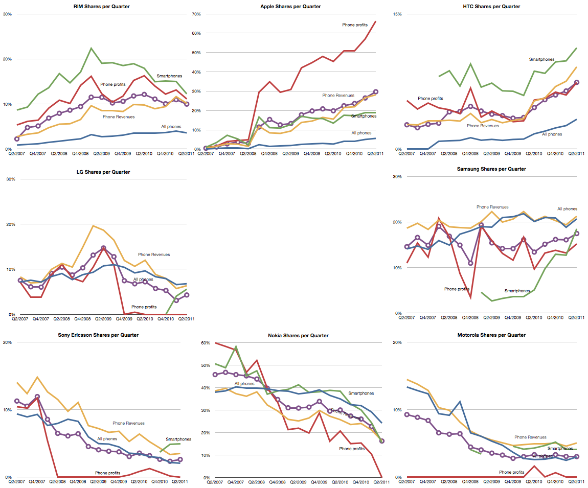
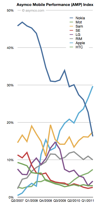
This is an updated view of the AMP index including Q2 data. As a reminder, the AMP (Asymco Mobile Performance) index is an unweighted average of four “shares”:


  1. Share of all handset units sold (global)

  2. Share of smartphones

  3. Share of value (revenues)

  4. Share of profits


You can see the last quarter’s standings here.


The updated index figures and spark lines are shown also on the right-most column on this site.


The biggest mover was Nokia which dropped 6.5 points. The second mover was Apple, with a gain of 3.2. Samsung followed with a gain of 1.38 and LG with a 1.21 and HTC with a gain of 0.95.


RIM lost about 1 point and Motorola and Sony Ericsson remained nearly flat.


The plunge in Nokia’s AMP score is nearly matched by Apple’s gain over the four year time period observed.


The full picture of each component is shown below:


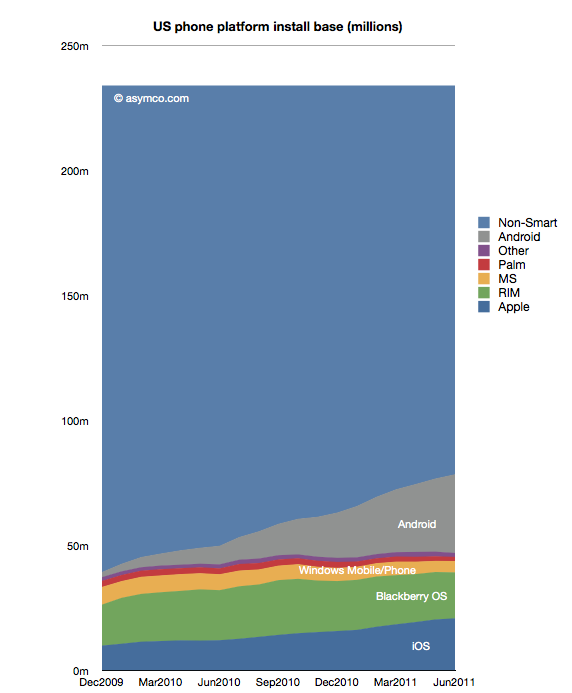
155 million American mobile phone users don’t use smartphones

155 million American mobile phone users don’t use smartphones:

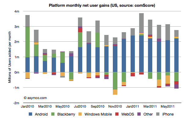
ComScore’s latest survey data shows the following net user gains in the US smartphone installed base:


In summary, the key data points for June:


  • 2.8 million new smartphone users in three month period ending June (vs three month period ending May)

  • Of the total 78.5 million users, about one million switched platforms

  • RIM had a net loss of about 600k users

  • WebOS lost about 195k users

  • “Other” (mostly Symbian) lost 273k users

  • Windows Mobile/Phone reversed two months of decline and added 100k users

  • iPhone added 452k users (considerably below its approximately 1 million/month run rate for last four months)

  • Android gained 2.2 million users, consistent with average over 7 months.

  • Platform “churn” was at 1.36%, about average over three months


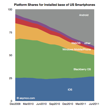
Installed platform shares for the US market are shown in the following chart


Platform Installed base vs. non-smart devices is shown below:


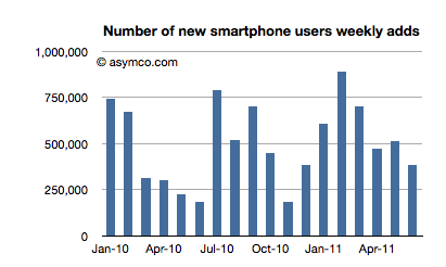
The penetration of smartphones slowed down in June (though that seems to be seasonal). The following chart shows weekly smartphone adds (or feature phone losses as total user base has held constant.)


Averaging the adoption rate over six months gives a “tipping point” forecast (50% penetration) of October 1st, 2012. That still means that 155 million American mobile phone users don’t use smartphones.


The Mobile Marshalling Yard

The Mobile Marshalling Yard:

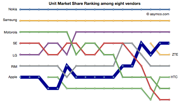
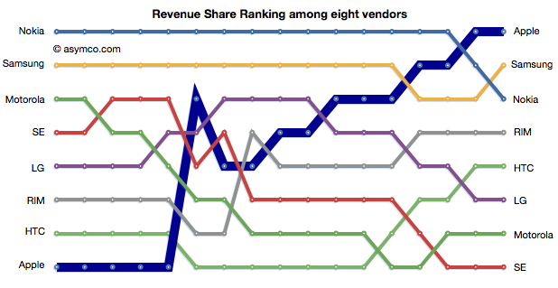
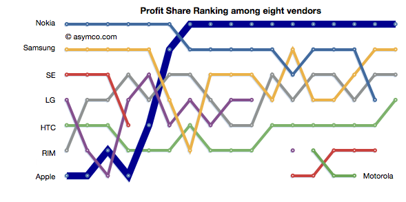
The phone vendors’ ranking relative to each other on three measures of share (Unit or Volume, Revenues and Operating Profit) is shown below:


Although not much changed in the unit rankings since last quarter, revenues did see Samsung and Nokia trade places. In the case of Profitability, the chart shows a sparseness that is quite unprecedented. Only positive profit figures are charted.


The fate of mobile phone brands

The fate of mobile phone brands:

The violence with which new platforms have displaced incumbent mobile vendor fortunes continues to surprise.


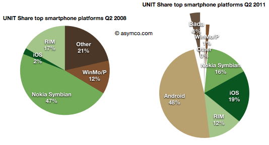
  • Nokia’s Symbian platform has gone from 47% share to 16% in three years

  • Microsoft’s phone platforms have gone from 12% to 1%

  • Other platforms have gone from 21% to zero

  • Although far less dramatic, RIM’s decline from 17% to 12% is causing acute pain and anxiety


This while entrants have grown share in spectacular fashion:


  • Android from zero to 48% (A two year period)

  • iOS from 2% to 19%

  • Bada from zero to 4% (two quarters only)


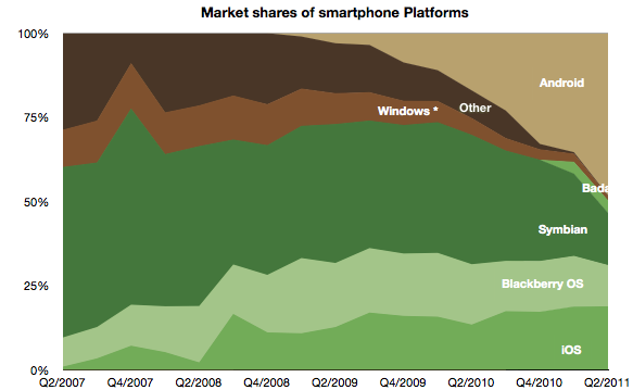
The picture of platform share over time looks like this:


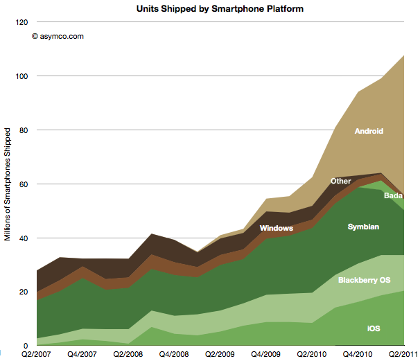
The platform volume growth is shown in the following graph:


Shocking


Or is it?


The surprising thing is that it should not be surprising. When the iPhone re-defined the basis of competition (at the beginning of the time frame of these charts) it unleashed forces which are still spinning the industry into a new configuration.


In that context, Android is a natural consequence. As iPhone created a threat, the response from all other vendors (other than Nokia and RIM) was to seek something that would sustain their business. Android was salvation.


It enabled the pursuit of better margins and hence better returns. So much so that Android offers the escape up-market they have always sought. It enables vendors to abandon the profit-free feature phones to low-end entrants like ZTE and Huawei.


LG, Samsung, Motorola and Sony Ericsson all took the bait. They are racing as quickly as possible to turn their feature phone portfolios into Android portfolios. This is certainly something that Google also wants to see happen and has been planning all along.


However one of the consequences of the modular (aka “open”) approach is that the low end disruptors gobbling up low-end share are also motivated to move into the Android business as soon as it comes within reach. The only reliably predictable consequence of Android will be the postponement of displacement of the existing brands by the low-end entrants.


Is this fate unavoidable for all brands?


Clearly some vendors see the trap. For all its apparent failings, Nokia saw this outcome and chose to attempt a “Hail Mary Pass” with Microsoft. The strategic point being that because they no longer had faith in their ability to execute on an independent platform, they would pick a platform that gave them at least some control or leverage. There are serious risks and problems with this approach–something which has been covered here already–but the bet being made is a clear rejection of the slippery Android slope.


RIM is trying to resist with QNX which is a similar approach but timing may also be the undoing of this strategy. HP’s approach with WebOS and Samsung’s Bada are also hedges to avoid this fate.


And what about Apple?


Apple is always skating in a different direction. iOS needs to be seen as not so much a phone platform but a computing platform. Given what we know, iOS was always conceived as the future of computing. Voice, after all, is just an app on iOS. So my expectation is that Apple’s iOS will continue its attack on the mobile computing market, skimming (or carving as the case may be) profits from the phone business to sustain its ultimate target of reclaiming the computing universe.


By this thinking iOS lives only by improving more rapidly than anything else in dimensions that redefine the basis of performance. In other words, doing more of what the iPhone did in the first place to set off this disruption.


A new view into the phone market

A new view into the phone market:

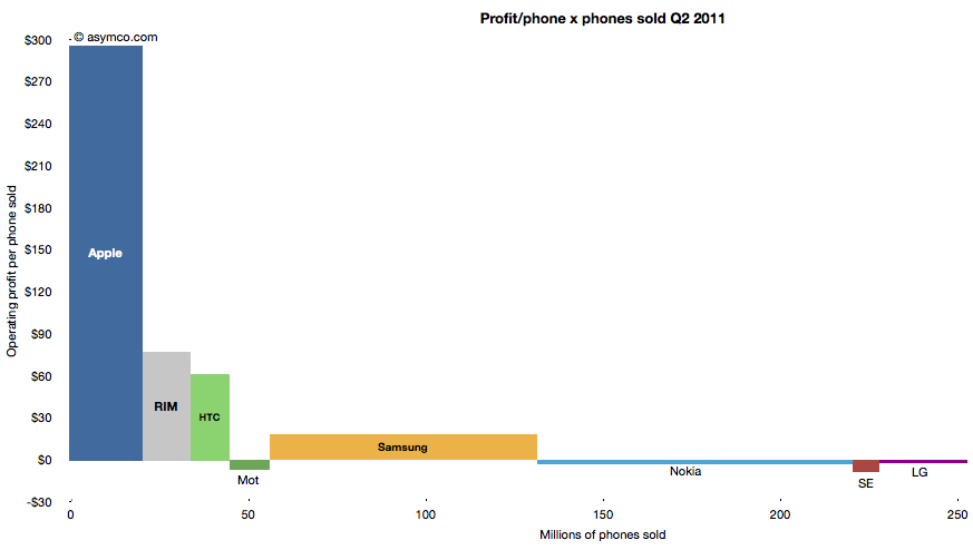
The profitability (aka Profit/Phone x Phones Sold, aka Rawr) chart is a great way to see the “shape” of the industry at a glance, with attention to volume and profitability.


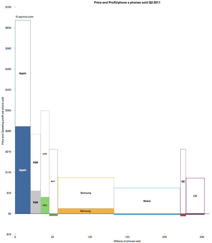
What is missing however is a perception of the sales level and the pricing of the products. To help in that regard, I prepared an extension to the profitability chart which covers the price and sales for each participant.


You can interpret this graph as an extension of the profitability chart where the “empty” or white areas above each profit area are payments to suppliers and operating expenses. Thus the sum of empty and filled areas (above zero) are equivalent to revenues. If the sum of the empty and filled areas are greater then revenues (i.e. they extend below zero) then the difference is operating losses.


The top of both empty and filled rectangles are set at the average selling price per phone (and the top of each filled rectangle is the operating profit per phone). The width of both rectangles is the volume of phones shipped.


The things you can read into this chart are:


  • Margins at a glance (ratio of filled area to total area)

  • Sales as well as profit relative to peers (top of each box relative to others)

  • Pricing power (overall top relative to competitors)

  • Any combination of the above


Finally, the sum of all the areas are the overall market revenues for the quarter. Sum of white areas are expenses and sum of solid areas are profits & losses.


A natural evolution of this chart would be to animate it across multiple quarters/years.


The Competition

The Competition:

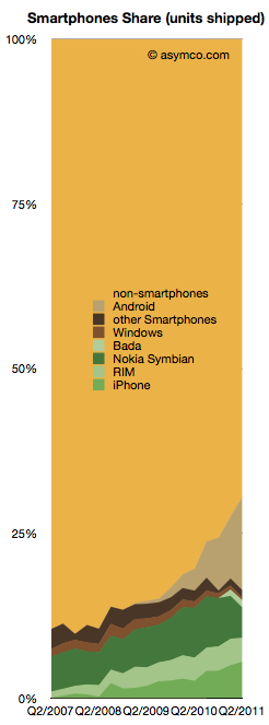
Smartphones made up about 30% of global phone sales last quarter. That is a significant increase from 10% in Q4 of 2007.


From this perspective, iPhone obtained 5.6% share, Android 14.2%, Nokia Symbian 4.6%, RIM 3.6%, Bada 1.1% and Windows 0.4%.


The competition however still has 70.5%.


The chart to the right shows the challenge remaining and the progress being made.


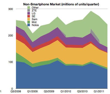
The good news is that the non-smartphone market is not growing while the smartphone market is. In fact, the non-smart market has had a three year CAGR of 0% and a y/y growth of 1.0% and a sequential decline of 6%.


The non-smart portion of each branded vendor’s business is pretty dismal:


  • Nokia saw 17.57% decline y/y

  • Samsung’s non-smart business declined by 8.14%

  • Sony Ericsson’s dropped by a dramatic 80%

  • LG’s fell by 38.56%

  • Motorola is the only one that grew y/y, by 17.86.


The reason all these brands fell is because the unbranded vendors took their place. “Other” non-smartphones grew by 43%. They have been sustaining growth at the rate of 57% compounded over three years.


The following chart shows the increasing share taken by the “other” vendors in non-smartphone units:


The non-smart business is so dismal for branded vendors that I’ve been assuming that they will cease to build such devices in the near future.


The trend is shown in the following chart which shows the percent of units for branded vendors which are smartphones.


Motorola, Sony Ericsson and Samsung are fleeing to smartphones as rapidly as they can. LG is following as quickly as possible as well.


The only question remains with Nokia. While their smartphone business evaporates they’ve also made a commitment to the non-smartphone market and are thinking about “the next billion” users who, presumably, will not buy smartphones and will buy some variant of Nokia’s Series 40.


Targeting the low end may be commendable, but the question they need to answer is why would those next billion buy anything other than a low cost smartphone? And if not, then what’s so different about the next billion?


The Android and iOS pincer movement

The Android and iOS pincer movement:

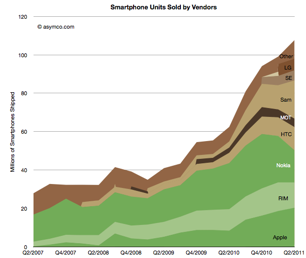
Nearly all the data on smartphone shipments is now available for the second quarter 2011. Some fragments are still not public, including ZTE and Huawei (and any others) shipments. We also have estimates for the various platforms including an estimate for Windows Phone and Bada (though not for WebOS).


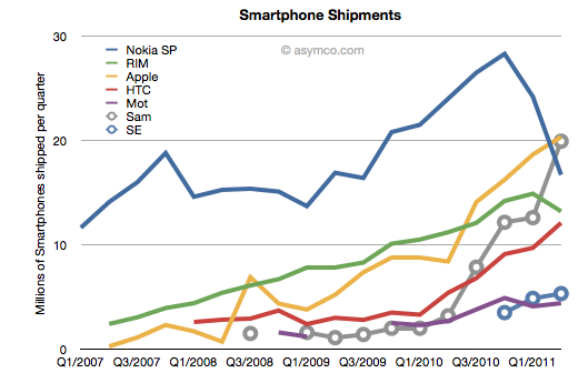
This allows the following chart:


Using the traditional color scheme which separates “integrated” from “modular” vendors, the chart shows overall volume growth and how the volumes are split among vendors.


The market grew at about 73% y/y and 50% compounded over three years and 9% sequentially. The y/y growth rates for individual vendors were:


  1. Samsung 525%

  2. Apple 142%

  3. HTC 124%

  4. Motorola 63%

  5. “other” 29%

  6. RIM 18%

  7. Nokia -30%


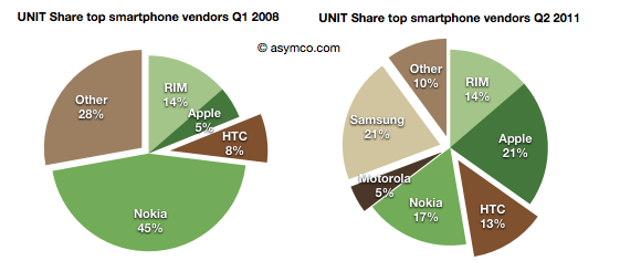
In terms of unit share, the pie charts below show the before and after (three year span):


And the stacked area below shows every quarter over a four year period.


The story is largely unchanged since last quarter except perhaps in the rapidity or deterioration in Nokia’s performance and Samsung’s partial exploitation of that decline.


It should be noted that not all of Samsung’s volumes are licensed platforms. An increasing share of Samsung smartphone volumes is Bada, an internally developed OS.


In the charts above I arranged the bars to place Nokia and RIM in the middle to show their double envelopment. A pincer movement is only an analogy but perhaps it’s evocative of what’s happening.


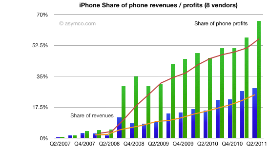
Apple share of phone revenues increased to 28%

Apple share of phone revenues increased to 28%:

As previously pointed out, Apple reached two thirds profit share in mobile phone vendors among the eight vendors I track. The following charts shows the historic growth in that share and the share of revenues (including 4 quarter trend line). Revenue share increased to 28% in the last quarter.


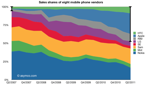
The share doubled from Q4 2009. I should also point out that it was the highest of all the competitors. The following chart shows the split over time:


The dedicated smartphone vendors (highlighted with segment bars) are now at 47% of total sales, a significant increase from the 6% share they held four years ago. Another remarkable show of entrant power and incumbent weakness.


Nokia vs. Android

Nokia vs. Android:

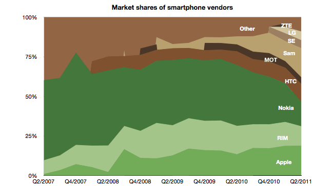
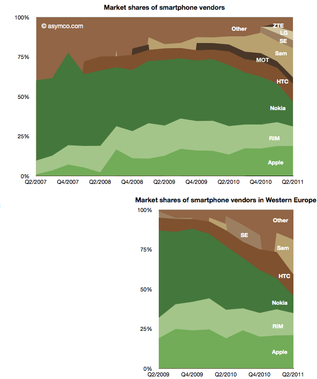
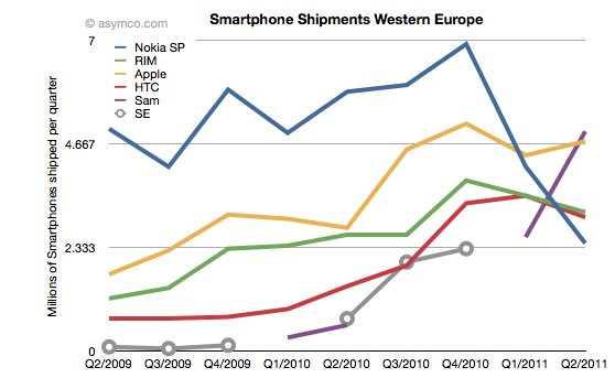
Two years ago Nokia sold 30% of its smartphones in Western Europe. Today it sells 15% in that market. Its unit shipments went from 5 million to about half that and its market share went from 55% to 11%. Its rank in the market went from first to fifth.


The fall is exceptional and dramatic. The two charts below show smartphone market shares. The top chart shows global share and the second shows Western European smartphone shares (European share data sourced from IDC).


The other perspective is shown the the following chart which shows actual units shipped.


One striking thing is how volumes collapsed into Q1 and Q2 this year, coinciding with the public decision in February to deprecate Symbian. The other interpretation I would make is that within the two year time frame Nokia’s share has been completely absorbed by Android, not Apple. Whereas most commentary shows Nokia suffering at the mercy of Apple, it’s Android that took share in Europe.


Can a Windows Phone portfolio turn Nokia’s fortunes around? The first problem is that such a portfolio will not be available until next year. The second problem is that the competition will not be standing still. The third problem is that the market itself may not be growing as fast as expected.


It’s becoming increasingly difficult to see how Nokia can weather this turbulence and odds are against it.


Monday, August 01, 2011

The end of easy growth in smartphones

The end of easy growth in smartphones: "

At the end of last year I was saying that the smartphone boom was a tide that lifted all boats. That is no longer the case.


But the big story is that there has been a clear non-seasonal counter-cyclical decline in Nokia and RIM’s smartphone performance. RIM’s steady rise has come to an abrupt halt. Nokia’s decline has accelerate precipitously. So much so that Samsung and Apple have overtaken Nokia and RIM and it looks like HTC will overtake RIM within one quarter and perhaps Nokia as well.


The fortunes of vendors is now clearly tied to the fortunes of their platform choices. Android has a spotty record with Samsung[1] and HTC having accelerated growth with Android, Motorola and Sony Ericsson have not rallied to a similar degree (though they did remain operational). But it’s at least very clear that BlackBerry OS and Symbian are now a burden to their owners.


The fact that not all vendors benefit from a boom indicates that the early, happy days are over. People are noticing that there is a difference between smartphones and are not buying any and all. An era of competition will follow. I hinted that such a shift would happen when a “tipping point” was forecast and that point has been reached in several mature markets.


The consequences are that weaker platforms and vendors will come under increasing pressure.


Notes:


  1. Samsung decided to stop reporting the number of smartphones they sell. They also refuse to report the break-down between different platforms–they sell Windows Phone, Bada and Android devices. The figure I gave to Samsung is 19.9 million units, higher than 19.0 and 19.3 million from other analysts.


"

Saturday, July 30, 2011

The Profit/Phone x Phones Sold Chart

The Profit/Phone x Phones Sold Chart: "

The following chart shows the current profit distribution between phone vendors with an eye toward identifying volume dependencies. The vertical axis represents operating profit per phone and the horizontal axis the number of phones sold.


The area of each vendor bar is therefore the total operating profit that vendor captured. A vertical (portrait) orientation implies high profitability with relative low volume while a horizontal (landscape) orientation implies a high volume/low profitability focus.


The other important observation is that bars can also be negative. Those vendors’ names are listed below the bars rather than within them.


You can also compare the chart with the one from last quarter:


The Rawr Chart | asymco


"

Friday, July 29, 2011

Apple captured two thirds of available mobile phone profits in Q2

Apple captured two thirds of available mobile phone profits in Q2: "

The major publicly traded phone vendors have all reported results for the second quarter. Based on the data available so far we can begin putting together a picture of the market.


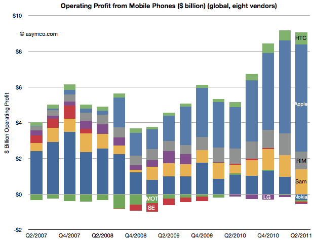
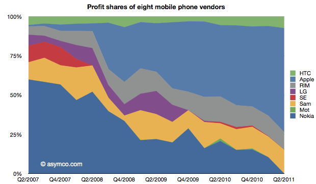
The first picture I’ll draw is usually the last: profitability. The following chart shows operating profit from the sale of mobile phones among the eight vendors I follow (Nokia, Samsung, LG, Sony-Ericsson, Motorola, HTC, Apple, RIM).


This quarter saw a slight sequential decline in overall profit for the sector, but four vendors did not manage a profit from selling phones. Nokia, Motorola, Sony-Ericsson and LG all saw losses. The other vendors split the slightly decreased pie with Apple getting two thirds of it (66.3%)


This share is up from 57% in Q1 and 50% in Q3 and Q4. Samsung’s share went to 15%, though that’s not a peak level historically. In Q1 2008 the company was at 21%. RIM was at 11%, a level in a range that has been unchanged for three years. Finally, HTC captured 7.4%, a new high and an increase from 6% since last quarter. The profit share chart follows:


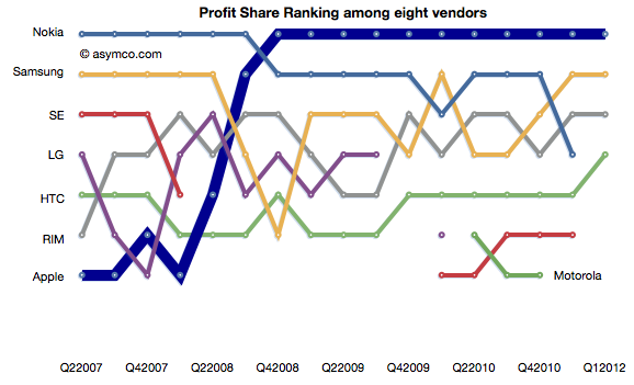
The ranking chart for profitability follows:


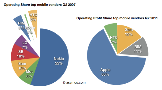
Finally, the “before-and-after” view of profit capture showing the change in profit share over a four year period.


The story remains largely unchanged from last quarter: Three companies which captured 11% of the profits before the modern smartphone era started (four years ago!) now capture 84% of the profits. Only one global brand phone vendor selling non-smart voice-oriented feature phones is still profitable however, as we shall see later, the only reason profits still exist for any vendor is due to the strength of their smartphone portfolio.


"

A new way of measuring Openness, from Android to WebKit: The Open Governance Index

A new way of measuring Openness, from Android to WebKit: The Open Governance Index: "

[Much has been said about open source projects – and open source platforms are now powering an ever-increasing share of the mobile market. But what is “open” and how can you measure openness? As part of our new research report (free download), VisionMobile Research Partner Liz Laffan introduces the Open Governance Index – a new approach to measuring the “openness” of software projects, from Android to WebKit]


Open Governance Index cover


Openness as a function of governance


We at VisionMobile have been researching, investigating and helping to educate the industry about open source for the past five years. In this time open source software has been transformed from geekware to business as usual. Much has been written and debated regarding open source licenses – from the early days of the GPL license to the modern days of the Android platform.


Despite the widespread use of open source, from Android to WebKit, there is one very important aspect that has been neglected: openness and how to measure it.


Openness goes far beyond the open source license terms and into what is termed Governance. While licenses determine the rights to use, copy and modify, governance determines the right to gain visibility, to influence and to create derivatives of a project, whether in the form of spin-offs, applications or devices. And while licenses apply to the source code, governance applies to the project or platform. More importantly, the governance model describes the control points used in an open source project like Android, Qt or WebKit, and is a key determinant in the success or failure of a platform.


VisionMobile - Licensing vs. Governance Models


The governance model used by an open source project encapsulates all the hard questions. Who decides on the project roadmap? How transparent are the decision-making processes? Can anyone follow the discussions and meetings taking place in the community? Can anyone create derivatives based on the project? What compliance requirements are there for creating derivative spin-offs, applications or devices, and how are these requirements enforced? It is governance that determines who has influence and control over the project or platform – beyond what is legally required in the open source license.


In today’s world of commercially-led mobile open source projects, it is not enough to understand the open source license used by a project. It is the governance model that makes the difference between an “open” and a “closed” project.


Measuring openness


Our research (free copy of full report here) showcases eight mobile open source projects: Android, MeeGo, Linux, Qt, WebKit, Mozilla, Eclipse and Symbian. We selected these projects based on breadth of coverage; we picked both successful (Android) and unsuccessful projects (Symbian); both single-sponsor (Qt) and multi-sponsor projects (Eclipse); and both projects based on meritocracy (Linux) and membership status (Eclipse).


Our research, carried out over a six-month period, included analysis of these popular open source projects, through discussions with community leaders, project representatives, academics and open source scholars. This research was partially funded by webinos, an EU-funded project under the EU FP7 programme, aiming to deliver a platform for web applications across mobile, PC, home media (TV) and in-car devices.


We quantified governance by introducing the Open Governance Index, a measure of open source project “openness”. The Index comprises thirteen metrics across the four areas of governance:


1. Access: availability of the latest source code, developer support mechanisms, public roadmap, and transparency of decision-making

2. Development: the ability of developers to influence the content and direction of the project

3. Derivatives: the ability for developers to create and distribute derivatives of the source code in the form of spin-off projects, handsets or applications.

4. Community: a community structure that does not discriminate between developers


The Open Governance Index quantifies a project’s openness, in terms of transparency, decision-making, reuse and community structure.


VisionMobile-Open_Governance_Index


Does openness warrant success?


But what is it that makes an open source project successful? Why do some projects become an immediate success, while others barely get off the ground before crashing and burning? We know that just like commercial ventures, open source projects have different cultures and drivers – but we do believe that you should be able to measure the way that open source projects interact with the community of users and contributors that they build up around themselves.


Our research suggests that platforms that are most open will be most successful in the long-term. Eclipse, Linux, WebKit and Mozilla each testify to this. In terms of openness, Eclipse is by far the most open platform across access, development, derivatives and community attributes of governance. It is closely followed by Linux and WebKit, and then Mozilla, MeeGo, Symbian and Qt. Seven of the eight platforms reviewed fell within 30 percentage points of each other in the Open Governance Index.


Moreover, our research identified certain attributes that successful open source projects have. These attributes are timely access to source code, strong developer tools, process transparency, accessibility to contributing code, and accessibility to becoming a committer. Equal and fair treatment of developers – “meritocracy” – has become the norm, and is expected by developers with regard to their involvement in open source projects.


The Android Paradox


Android ranks as the most closed project, with an Open Governance Index of 23%, yet at the same time is one of the most successful projects in the history of open source. Is Android proof that open governance is not needed to warrant success in an open source project?


Android’s success may have little to do with the open source licensing of its public codebase. Android would not have risen to its current ubiquity were it not for Google’s financial muscle and famed engineering team. More importantly, Google has made Android available at zero cost, since Google’s core business is not software or search, but driving eyeballs to ads. As is now well understood, Google’s strategy has been to subsidise Android such that it can deliver cheap handsets and low-cost wireless Internet access in order to drive more eyeballs to Google’s ad inventory.


Equally importantly, Android would not have risen were it not for the billions of dollars that OEMs and network operators poured into Android in order to compete with Apple’s iconic devices. As Stephen Elop, Nokia’s CEO, said in June,2011, “Apple created the conditions necessary for Android”.


Download the full report for an in-depth analysis of the openness of Android, MeeGo, Linux, Qt, WebKit, Mozilla, Eclipse and Symbian. Drop us a line and tell us what you think.


- Liz


[Liz Laffan is a Research Partner at VisionMobile. Liz has been working in the telecoms and mobile industry for over 20 years, with large telco organisations, start-up technology ventures, software development and licensing firms. Liz's interests lie in open source software governance and licensing and in particular how best can commercial organisations interact with open source projects. She can be reached at liz [at] visionmobile.com]


"
Thursday, July 28, 2011

In U.S. Smartphone Market, Android is Top Operating System, Apple is Top Manufacturer

In U.S. Smartphone Market, Android is Top Operating System, Apple is Top Manufacturer: "

According to June data from Nielsen, Google’s Android operating system (OS) now claims the largest share of the U.S. consumer smartphone market with 39 percent. Apple’s iOS is in second place with 28 percent, while RIM Blackberry is down to 20 percent.


However, because Apple is the only company manufacturing smartphones with the iOS operating system, it is clearly the top smartphone manufacturer in the United States. Other leading manufacturers include HTC, whose Android phones represents 14 percent of the smartphone market and whose Windows Mobile/WP7 devices account for 6 percent of the market; and Motorola, whose Android devices are owned by 11 percent of smartphone consumers. Samsung’s Android devices are used by 8 percent of smartphone owners while their Windows Mobile/WP7 phones are used by 2 percent of smartphone owners.


june-2011-smartphone-share

"